Call us: 603.899.7495
Is Your Website Mobile Friendly?
Not sure how to tell if your site is responsive?
[av_customform_v2 link=” custom_email=”]
Click here input file element
[/av_customform_v2]
Call us: 603.899.7495
Responsive Design: Mobile ‘Magic’
If you’re not browsing the web using mobile devices such as smart phones and tablets, you quickly are becoming the minority.
Sure, most people today browse website from their desktops. But that’s changing, and the changes are, well, everywhere.
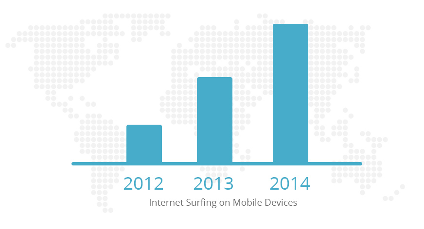
Internet browsing using mobile devices has more than doubled in the past two years.
Give it another year and it just may surpass browsing via desktop.
Still, the user experience today is not a memorable one. The screen often is a blur or is otherwise difficult to read. Until now, the response has been to spend time and
money creating an ever-growing number of websites designed for different screen sizes. Admirable, but, most agree, eventually impractical.
PiXate Creative is among those who have a better way.
It has developed a responsive website that will arrange the website elements to fit any screen naturally.
The technology is called Responsive Design.
Responsive Design detects a visitor’s screen size and changes the layout to fit the screen of the device
he or she is using.
The screen literally gets narrower or wider. And it doesn’t apply only to small screens. Larger screens
can take advantage of this technology, too. Globally, people are accessing the web via their
smartphones more often than ever.
A study by Google and Ipsos, a global market research company, focused on how consumers
use their smartphones.
“Smartphone ownership has jumped globally, increasing 11 percent to 44 percent of the total
population in Spain and by 7 percent to 38 percent of the total population in the U.S.” says
Jason Spero, Head of Global Mobile for Google.
The study also showed smartphone owners are not just browsing the web; they’re taking
action. Of the 92 percent of U.S. smartphone users who seek local information, 89 percent of
these take action such as calling a store or visiting a business.
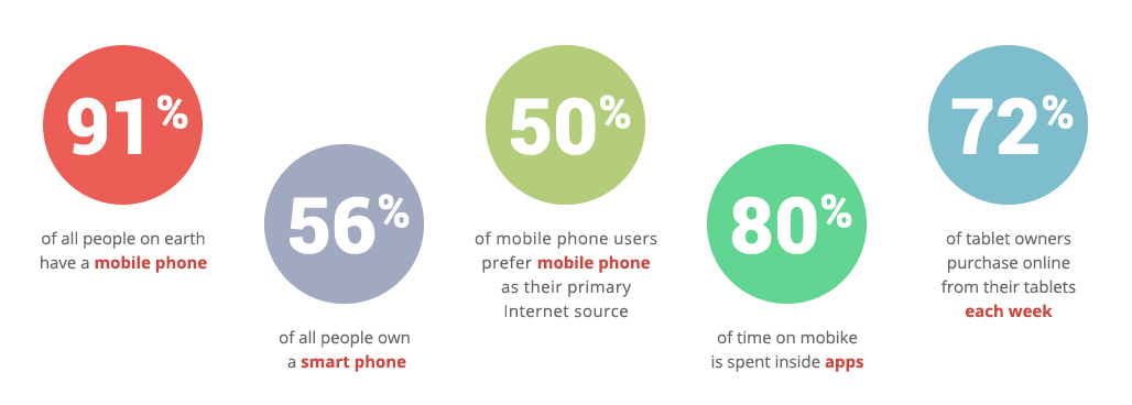
Digitalbuzzblog.com offers a sampling of the exploding mobile market:
Internet browsing using mobile devices: It’s here to stay.
And Responsive Design from PiXate Creative is helping to ensure that mobile users to your website have a positive experience.
© Copyright – PiXate Creative. All Rights Reserved
Call us: 603.899.7495


